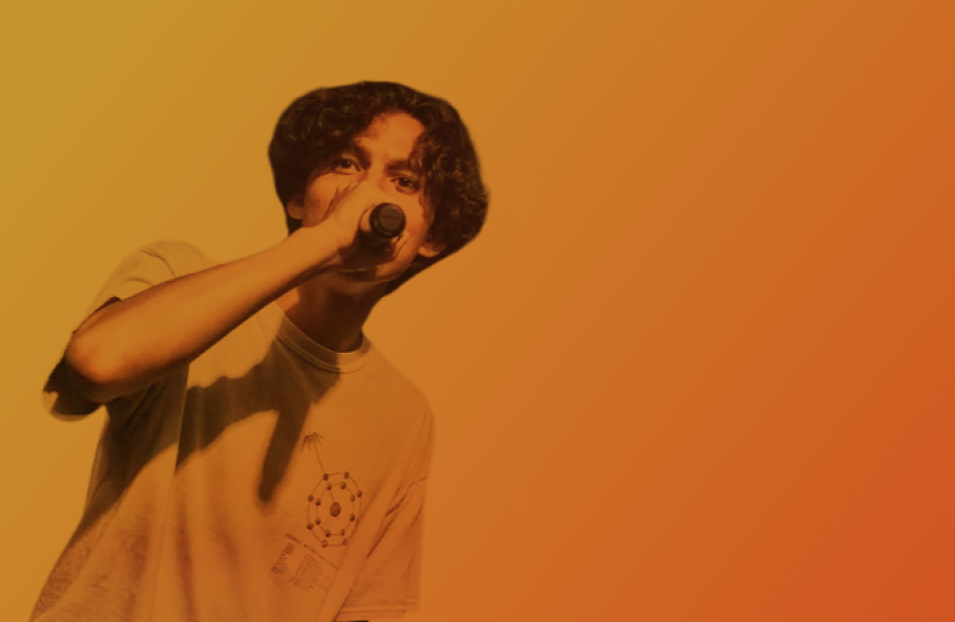
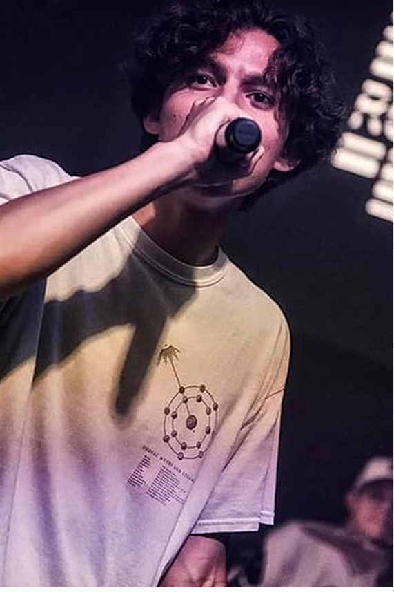
Project Plan Branding
A creative branding and content strategy initiative to
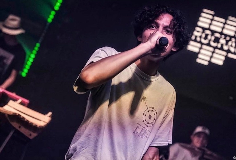
help indie/pop artist Owen Bryce express his identity
through a custom logo, website, cover art, and promotional
assets, highlighting his values of freedom, optimism, and
dreaminess.
Plannig
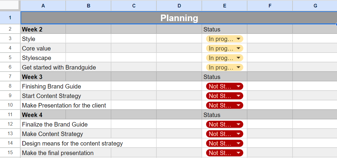
This sprint-based planning sheet outlines the
week-by-week tasks for developing Owen Bryce’s brand
identity. It tracks progress across design phases starting
with style exploration and brand values, moving through
content strategy, and ending with the final client
presentation. Each task is monitored with live status
updates to ensure timely delivery and effective team
collaboration.
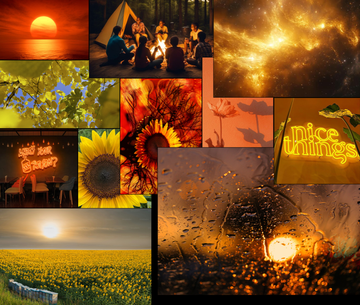
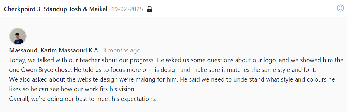
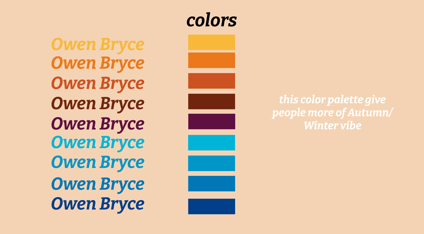
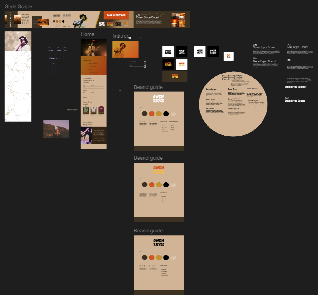
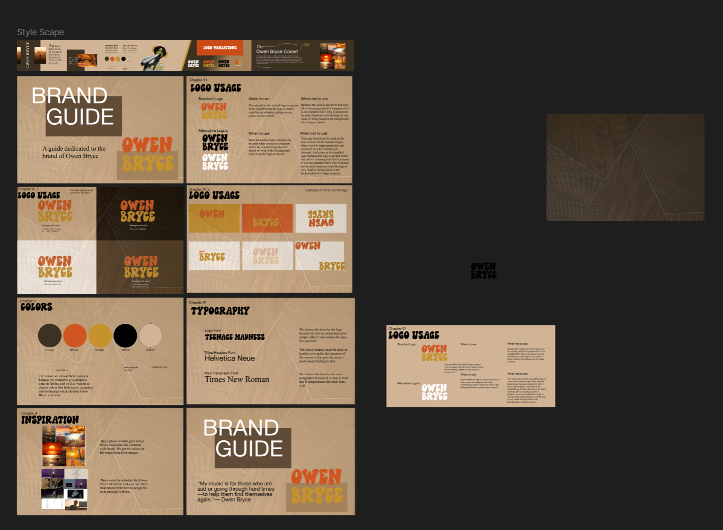
Style Scape
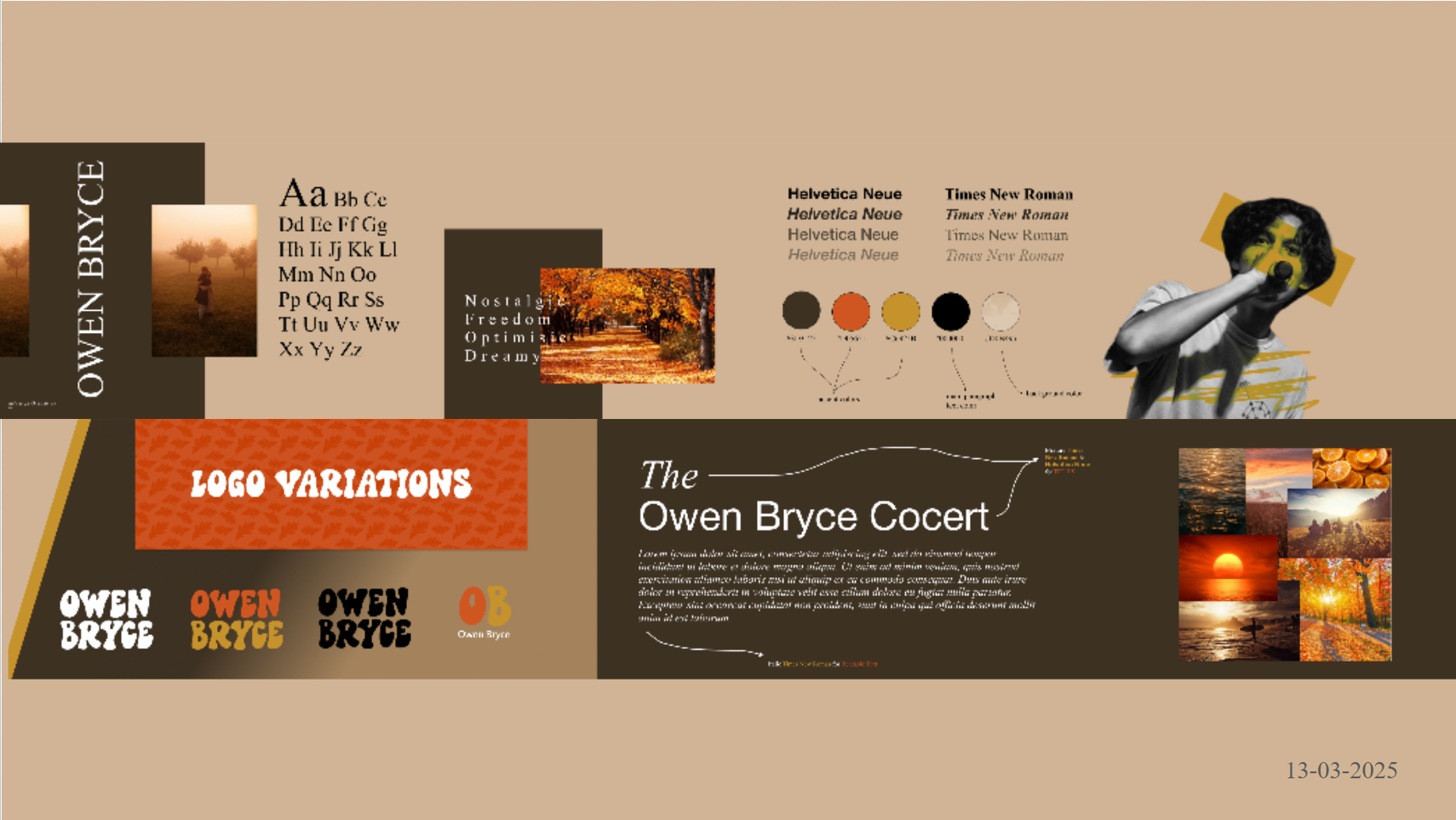
This visual board showcases Owen Bryce’s brand identity,
featuring typography choices (Helvetica Neue & Times New
Roman), a warm autumn-inspired color palette, logo
variations, and mood photography. It reflects key brand
values like freedom, optimism, and dreamines scapturing the
emotional tone and personality of Owen's indie/folk music.
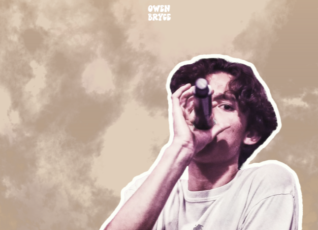
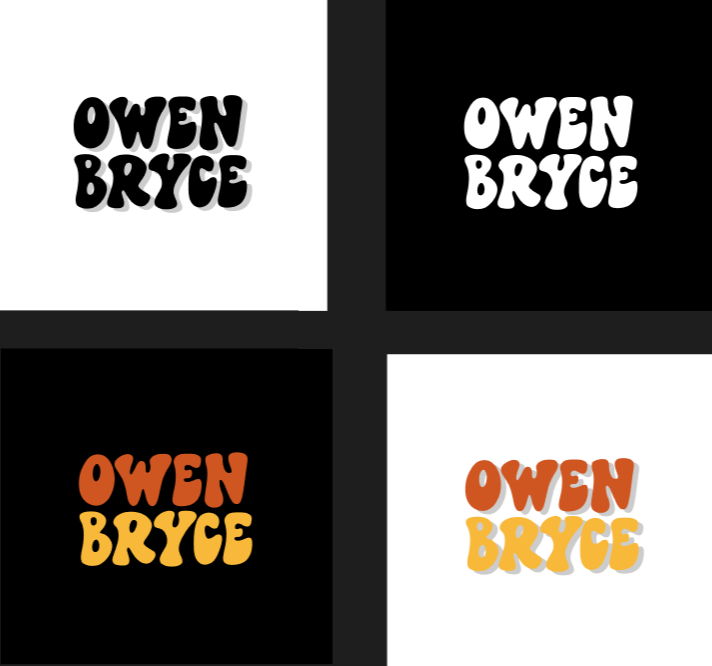
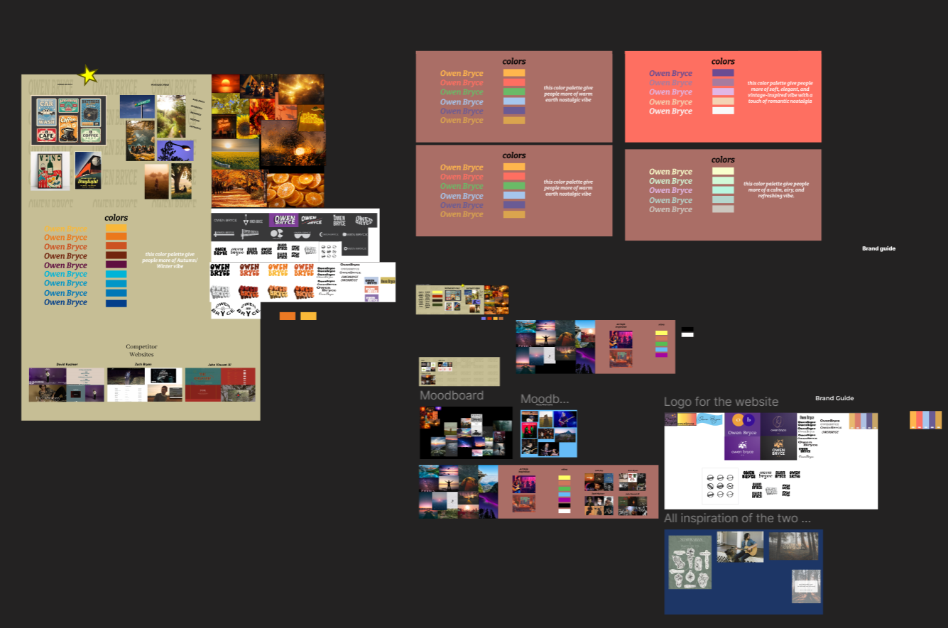
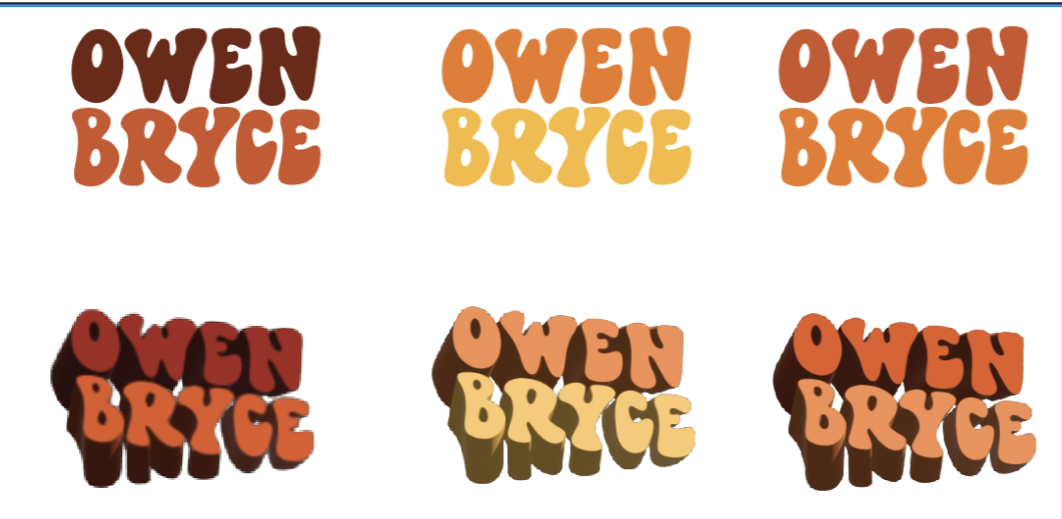
Brand Guide
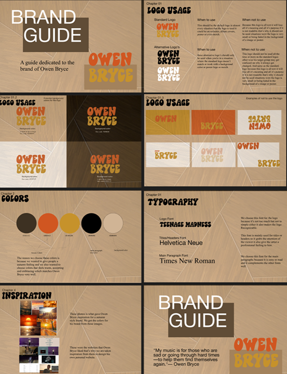
This comprehensive brand guide defines the visual and
emotional identity of Owen Bryce. It includes logo
variations and usage rules, a warm and nostalgic color
palette, typography selections (Teenage Madness, Helvetica
Neue, Times New Roman), and inspiration sources. The guide
ensures consistent branding across all platforms and
reinforces Owen’s message of freedom, optimism, and
self discovery through music.
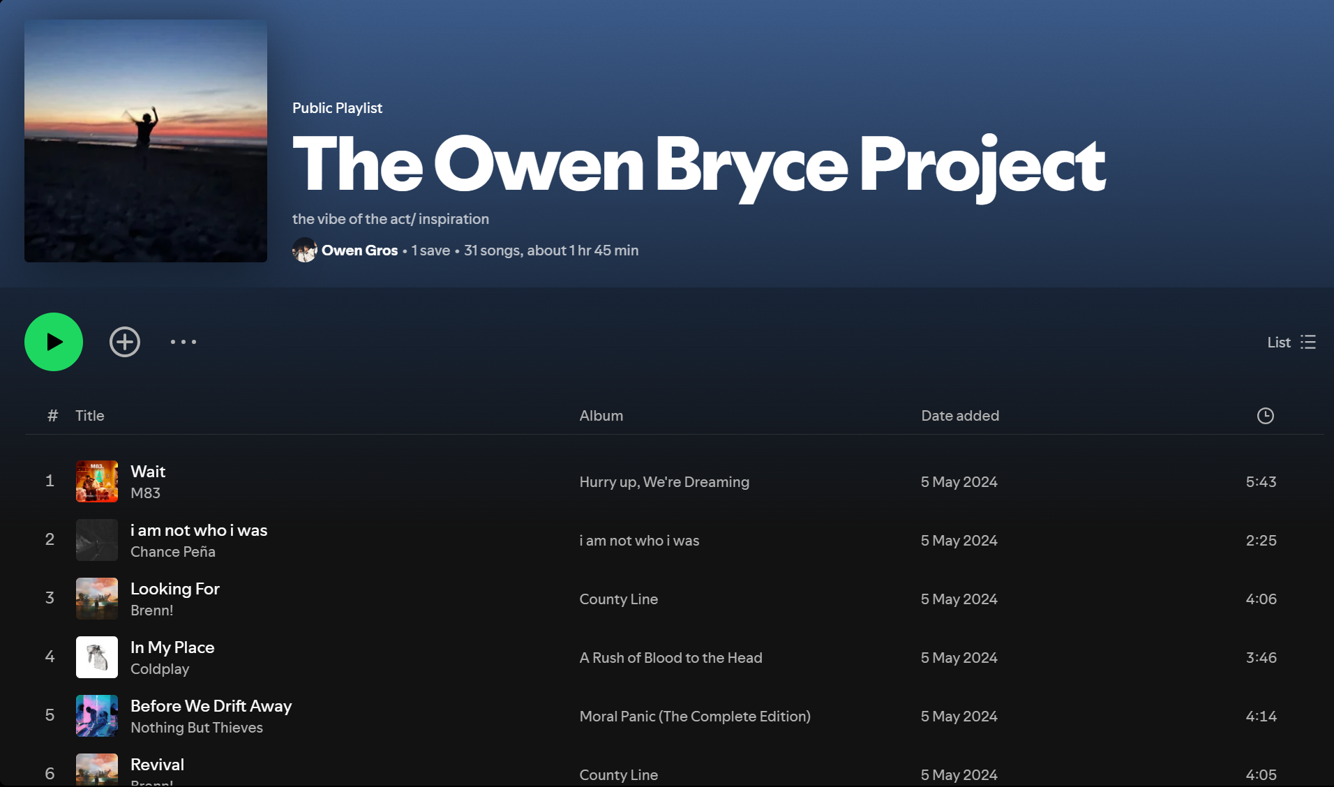
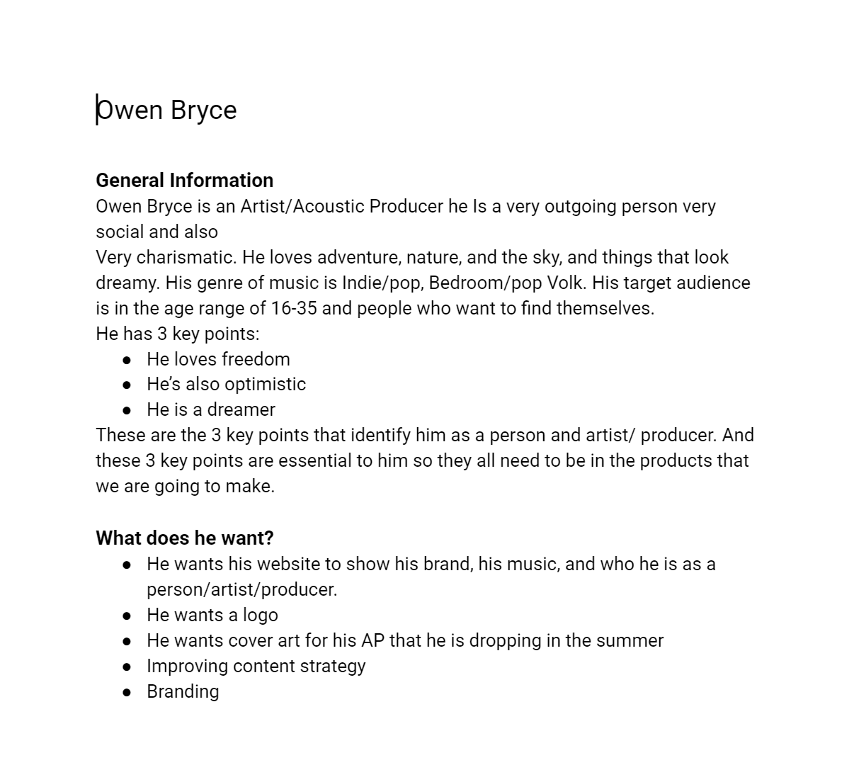
Communication
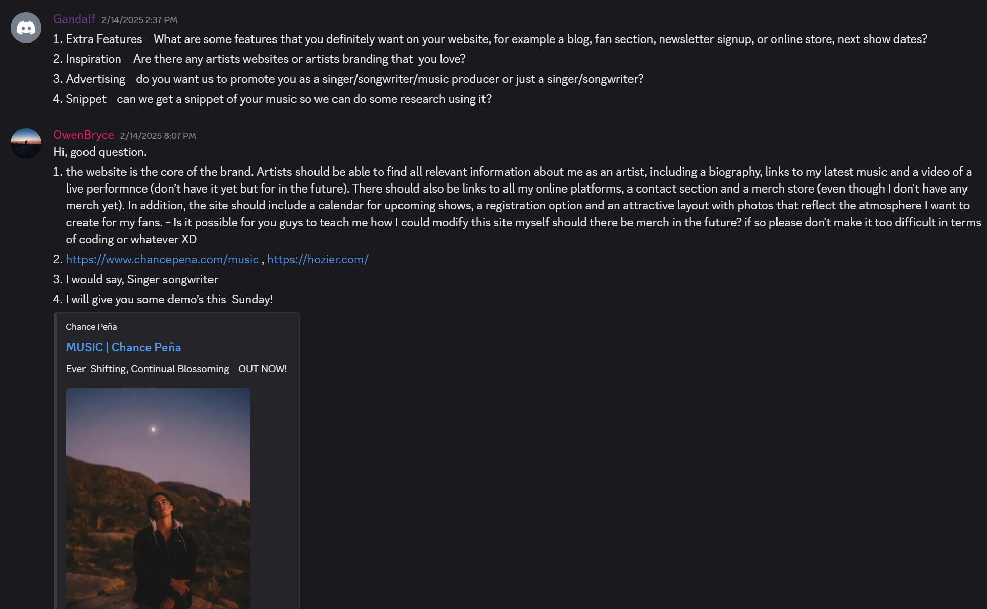
A direct conversation with Owen Bryce provided detailed
insights into his website needs and artistic vision. He
emphasized the importance of including a biography, music
links, visual atmosphere, a future merch store, and an
events calendar. He also referenced artists like Chance Peña
and Hozier as inspiration. This feedback guided the
structure, tone, and usability priorities of the final
website design.
Interview
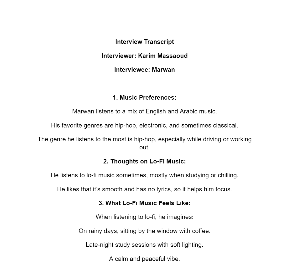
In this interview, Marwan shares his music preferences
and emotional connection to lo-fi music. His insights reveal
a preference for smooth, lyric-free tracks during focus
time, and a strong association between lofi and calm,
reflective moments. This feedback supports content decisions
for mood based playlists, design aesthetics, and audience
engagement strategies.
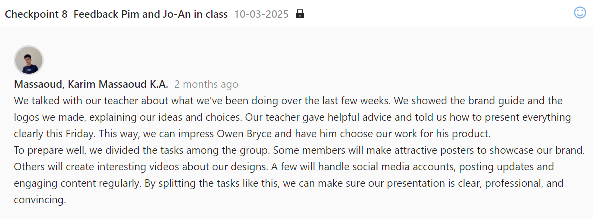
Presentation
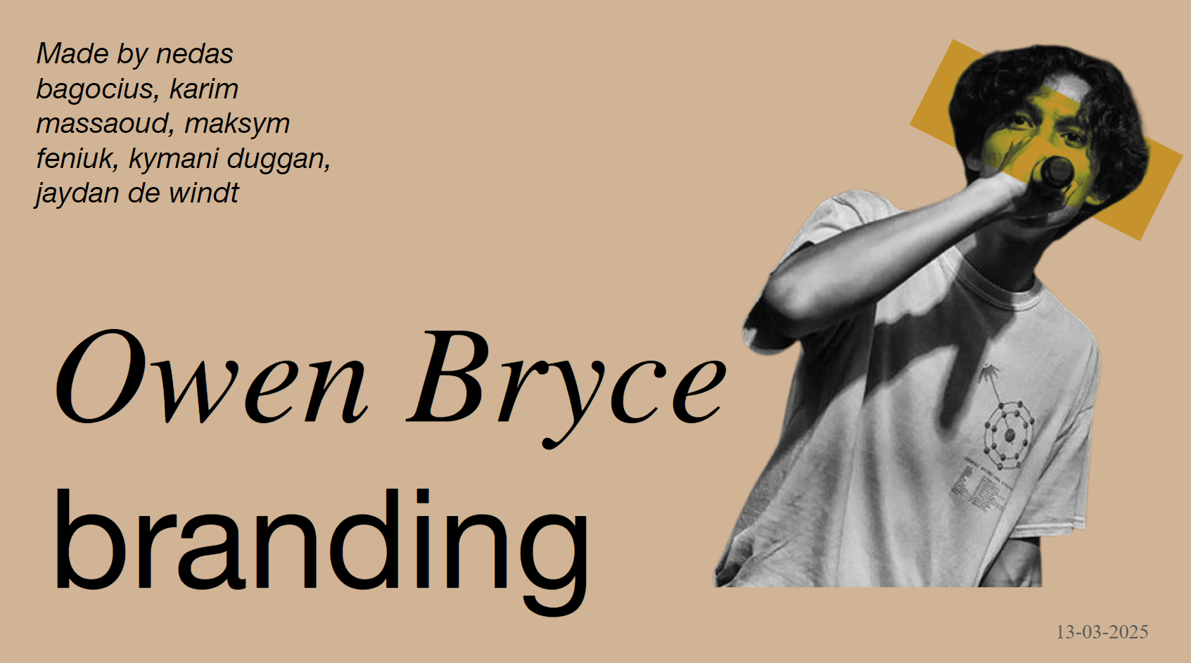
This final presentation showcases the full branding
journey for indie/folk artist Owen Bryce. Created by Nedas
Bagocius, Karim Massaoud, Maksym Feniuk, Kymani Duggan, and
Jaydan de Windt, the project combines visual identity,
storytelling, and strategic design to reflect Owen's
personality, values, and musical vision. Presented on
13-03-2025.
Team Charter
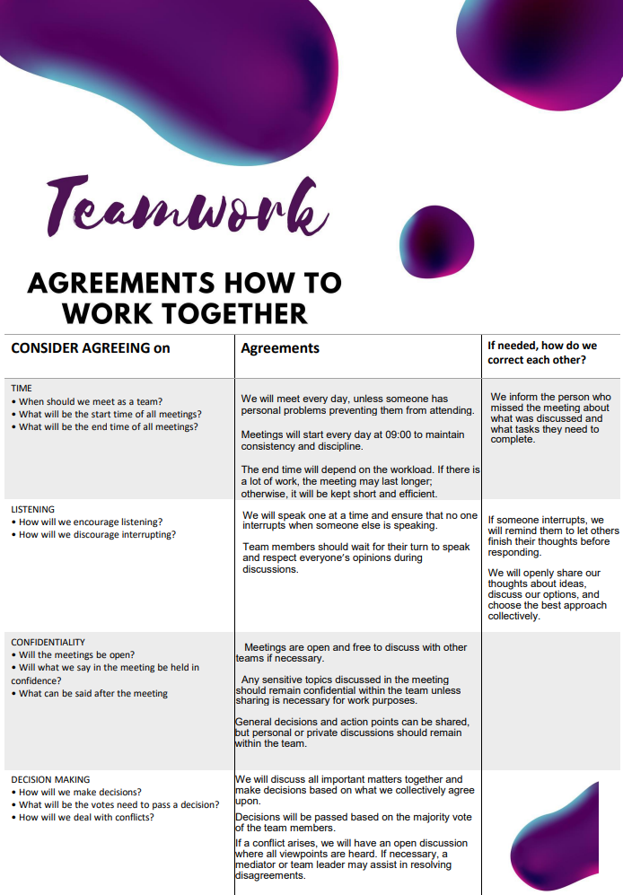
This document outlines our team's shared principles for
working effectively together throughout the Owen Bryce
project. It defines expectations for meeting times,
respectful communication, confidentiality, and
decision-making. These agreements help create a structured,
inclusive, and productive environment where all voices are
heard and contributions respected.
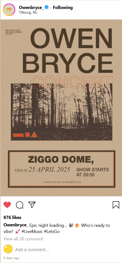
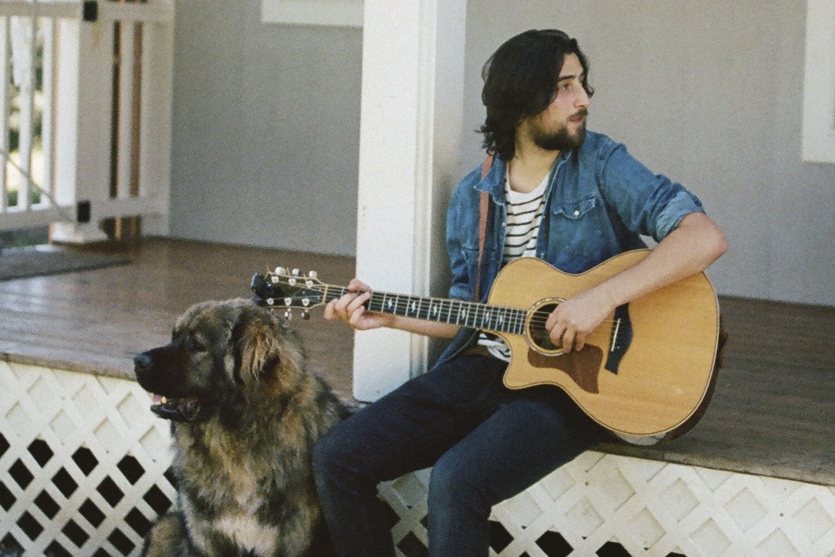
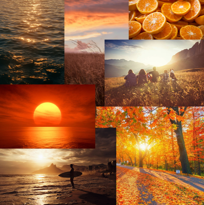
Inspiration & Posters
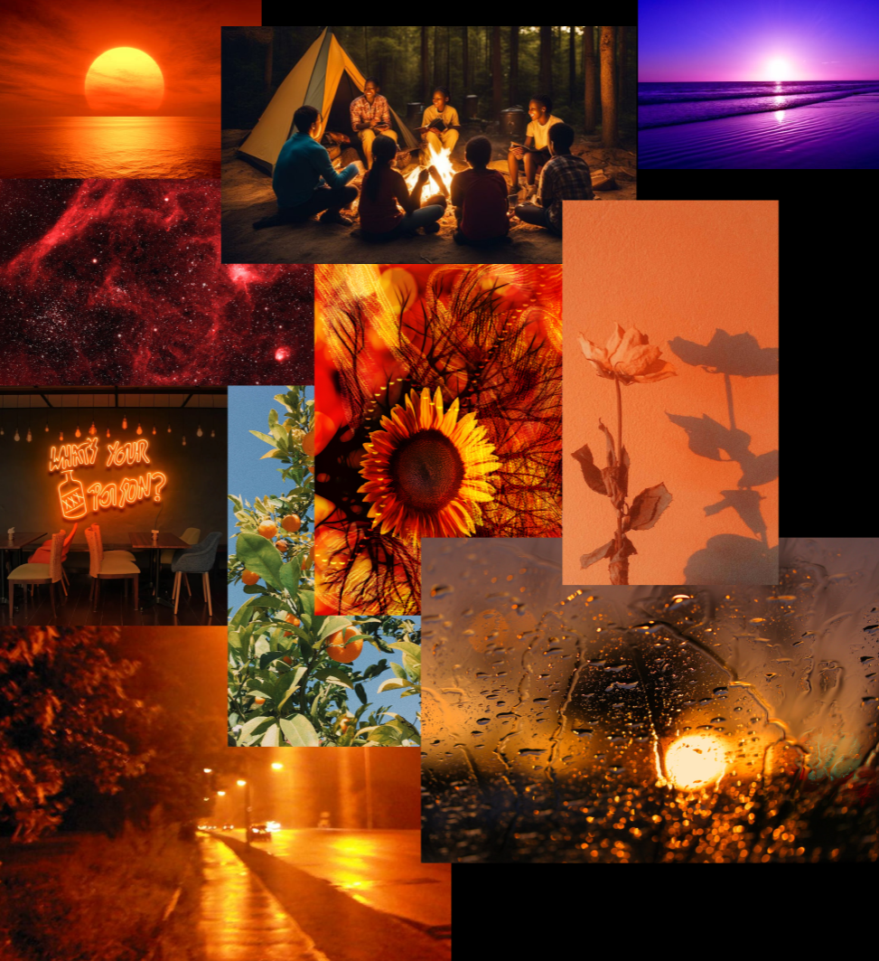
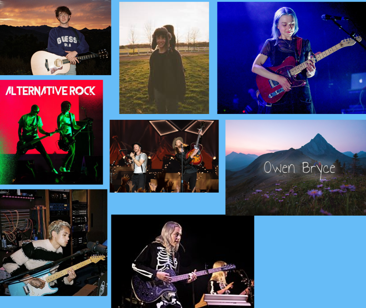
This moodboard captures the visual and emotional tone
behind Owen Bryce’s brand, highlighting themes of nature,
warmth, introspection, and freedom. These references
informed the color palette, poster aesthetics, and overall
atmosphere used throughout the branding project to reflect
Owen’s dreamy, acoustic indie style.